Bringing Together the Two Worlds of Data and Decision-Making
How to Go From Insights to Impact in the Business Arena

You love data! Otherwise, you wouldn’t be reading this blog.
For people like us, playing around with data is actually a lot of fun. You're thrilled just thinking about exploring a new data set, aren’t you?
Unfortunately, that level of excitement is not universal. Not everyone can see the matrix like we do. Sometimes you'll have to explain your dazzling data insights to people who live in the non-matrix world: our esteemed business decision-makers.
Why should you care? Because your brilliant analysis is only as good as your ability to explain it. Plus, they might be the ones in charge.
So let's get you geared up for that.
The Art of Communication in Data Analysis
The fine art of communication in data analytics is not a “soft skill” (even though we lumped it into the soft skill bucket twice in our previous piece); communication is an analyst’s core skill.
If people don’t understand what you’re talking about, then it’s as if your analysis never happened.
So, what's the trick?
It's not just about making things simple; it's about making them clear.
Say Goodbye to Technical Jargon
We get it, you've learned all these fantastic terms—linear regression, k-means clustering, neural networks—and you're itching to use them. But if you throw these terms around, you're going to see some eyes glaze over faster than a doughnut in a Krispy Kreme factory.
The trick is to understand the concept so deeply that you can explain it without jargon.
Try explaining your findings as you would to a friend who isn’t in the data field. Because honestly, no one cares how the sausage is made; they just want to know it’s delicious and why.
Here are some common data jargon terms that business stakeholders might find hard to grasp, and our off-the-cuff take on these:
- Linear Regression: The way we predict a Y based on X.
- Clustering Algorithms: Grouping similar things together.
- Neural Networks: Complex algorithms mimicking brain behavior for predictions.
- Covariance: How two variables change together, but not necessarily in a straightforward way.
- Time-Series Analysis: How things change when you look at them over a timeline.
- Standard Deviation: How spread out numbers in a group are.
- Correlation Coefficient: How strongly two variables are related.
- Normalization: Making data apples-to-apples comparable.
- Outliers: The extreme values that don't fit the pattern.
- Sentiment Analysis: Gauging public opinion through data.
- Data Imputation: Filling in missing data based on what we know.
- Bayesian Methods: Updating predictions as more data comes in.
- Machine Learning Models: Algorithms that learn from data.
- Data Warehousing: Where all the data lives.
- Data Lake: A big pool of raw data.
Ensure you understand these terms when you plan on using them when you explain your data. Because otherwise, you will struggle to translate them into plain English, ensuring everyone is on the same page.
In short, it's about making terms relatable, not avoiding them entirely. After all, each term serves a purpose; it's our job to make that purpose clear to everyone involved no matter how data-savvy they are.
Analogies, Metaphors, and Visual Aids: Your Best Friends
Remember the time you tried to explain your favorite game to your grandma? You didn't dive into the nitty-gritty details; you probably used a metaphor or analogy. The same goes for complex data patterns.
For example, you can compare the ebb and flow of sales data to ocean tides. It's familiar, it's intuitive, and people get it.
We are big fans of “doctor examples”. Because pretty much everyone can relate.
Similarly, you want to use visuals whenever possible. People are different in how they consume and understand information. A picture is worth a thousand words, and in our world, a well-designed chart or graph is worth a thousand data points.
Visuals can often communicate complexities faster and more clearly than any explanation.
But here's the catch—your visuals have to be as straightforward as your language.
Don't go overboard with the 3D effects and psychedelic colors. Keep it clean, keep it simple, keep it effective.
Bonus tip: If you’re just starting out working for a group of business stakeholders check in with them to see what the best pieces of analyses they had in the past. This will give you a good idea of whether you can already pull out that Marimekko chart or not.
Be Prepared, Not Scared, For Questions
No matter how much effort you make to aid your stakeholders’ understanding, they will have questions.
Questions from business stakeholders are not a sign that you've failed to explain yourself; they're a sign that people are engaged.
So take a deep breath and get ready for the Q&A session.
One trick we've learned is to anticipate the questions and prepare answers in advance. If you know your stuff, questions are just another opportunity to shine.
Here are 15 common questions that business stakeholders might ask about their data:
- What are the key findings from this analysis?
- How confident are we in these results?
- What data sources were used for this analysis?
- How recent is the data?
- Can you explain the methodology behind your analysis?
- What were the assumptions made in this analysis?
- How does this data align with our current KPIs or goals?
- What is the impact of these findings on our revenue or bottom line?
- Are these trends consistent over time?
- How do these findings compare to industry benchmarks or competitors?
- What are the risks if we follow these insights?
- What are the next steps based on this analysis?
- Are there any limitations or biases in the data that we should be aware of?
- How can we improve the data quality for future analyses?
- Can you break down this complex chart into simpler terms?
These questions are your roadmap for what to prepare for.
Being able to answer these clearly will not only satisfy curiosity but also demonstrate your grasp of both the data and its implications for the business.
Real-World Examples
Let's dig into a story that we think you'll find both instructive and relatable.
We had just finished a comprehensive customer segmentation analysis and were eager to share our findings with the marketing team.
Initially, our plan was straightforward: Identify different customer segments and tailor marketing strategies for each.
What We Initially Planned
We initially thought we'd just walk our marketing colleagues through the types of customer segments we had identified.
Each segment was beautifully defined using clustering algorithms…
…and we had data on purchasing behavior,
…engagement levels,
…and even preferred times for shopping.
Our PowerPoint was a data analyst’s dream.
How It Evolved
But then we remembered, these marketing folks aren't as jazzed about dendrograms and k-means clustering as we are.
So, instead of focusing on the “how”, we shifted our focus to the “what” and “why”.
We came up with an analogy: Different Spotify playlists for different moods.
Just as you wouldn't play your "Workout Hype" playlist during a romantic dinner, you shouldn't market high-end jewelry in the same way you'd market budget-friendly travel accessories.
It clicked instantly. Our discussion quickly moved from trying to comprehend the clusters to brainstorming marketing strategies tailored for each "playlist."
What We Learned
The big takeaway was that simplification doesn't mean dumbing down; it means making the information accessible.
We were able to take something as complex as customer segmentation algorithms and translate it into an action plan that the marketing team could implement immediately.
Conclusion: Bridging the Gap
Here's the bottom line: as a junior data analyst, your ability to communicate complex data insights is just as valuable as discovering those insights in the first place.
So the next time you're about to present your findings, remember you're not just a number cruncher; you're a translator between two worlds.
Master this skill, and you won't just climb the ladder—you'll teleport up it alongside key decision makers.
Julian Schulte
Related Articles
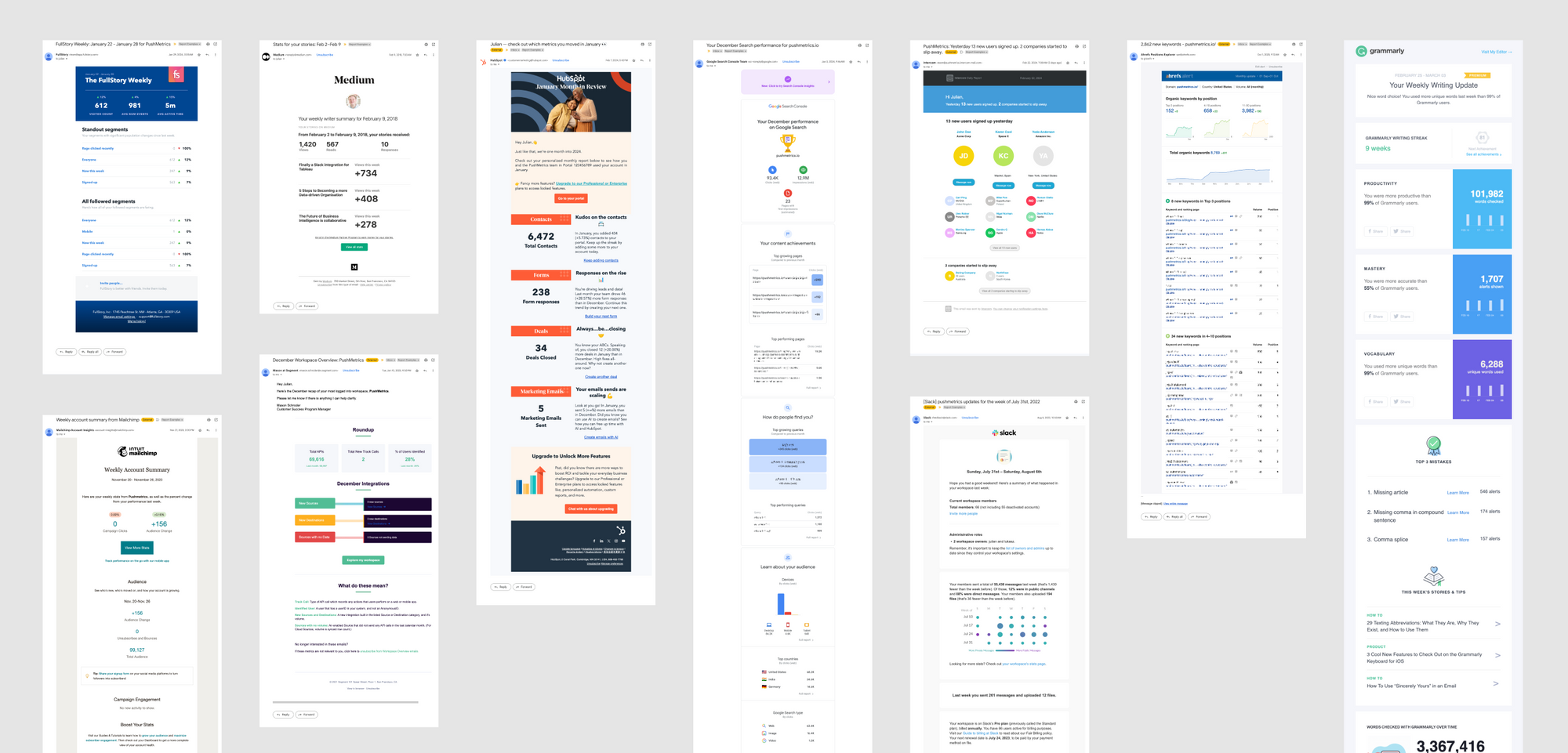
10 SaaS Usage Report Emails: How Companies Like Hubspot, Slack & Intercom Use Data To Maximize User Engagement
Product usage report emails are more than just automated messages; they're a window into how users interact with software, providing invaluable insights on engagement levels, feature adoption, and areas for improvement.

Julian Schulte
10 SaaS Usage Report Emails: How Companies Like Hubspot, Slack & Intercom Use Data To Maximize User Engagement
Product usage report emails are more than just automated messages; they're a window into how users interact with software, providing invaluable insights on engagement levels, feature adoption, and areas for improvement.
Julian Schulte
Subscribe to our newsletter
Get the latest updates from the PushMetrics team.
Thank you for subscribing.
Start sending data-driven messages today
Sign up and start using PushMetrics for free.
Or schedule a demo and discuss your use case.