10 SaaS Usage Report Emails: How Companies Like Hubspot, Slack & Intercom Use Data To Maximize User Engagement
Product usage report emails are more than just automated messages; they're a window into how users interact with software, providing invaluable insights on engagement levels, feature adoption, and areas for improvement.
Crucial for fostering customer loyalty and driving product engagement, product usage reports can make or break a user's decision to continue using a service.
This article delves into the strategies behind the product usage emails of ten leading SaaS companies - HubSpot, Grammarly, Segment, Medium, Mailchimp, FullStory, Google Search Console, Ahrefs, Slack, and Intercom.
Through detailed analysis, we aim to uncover the secrets to their success and offer actionable insights for enhancing your own usage report communications.
What are Product Usage Report Emails?
Product Usage Report Emails are designed to inform users about how they interact with a software product, offering insights into their engagement and activities. Their purpose is to enhance the user experience by providing personalized data that can guide users toward more effective use of the product.
Key characteristics include detailed analytics on usage patterns, comparisons over time, recommendations for improvement, and highlights of underutilized features. These reports aim to drive deeper product adoption and user satisfaction by making the data relevant and actionable.
Why Product Usage Reports Matter
Product usage reports are crucial for fostering a deep connection between users and software products through personalized, data-driven communication.
These reports offer insights tailored to each user's interaction with the product, highlighting areas of strong engagement and opportunities for further exploration.
By providing users with a clear picture of how they're leveraging the product, these reports not only enhance user satisfaction by making interactions more meaningful but also drive product adoption by encouraging the exploration of underutilized features.
Ultimately, well-crafted product usage reports serve as a foundation for improving customer satisfaction and loyalty, playing a pivotal role in retention strategies.
Analyzing 10 Real-life Examples
We have collected real examples of product usage report emails from these SaaS companies:
- HubSpot
- Grammarly
- Segment
- Medium
- Mailchimp
- FullStory
- Google Search Console
- Ahrefs
- Slack
- Intercom
In our analysis, we'll evaluate them based on several key criteria, such as design and aesthetics, personalization, actionability, frequency and timing, as well as content value.
So let's dive in:
1 - HubSpot
HubSpot is a CRM platform that offers a suite of software solutions for marketing, sales, content management, and customer service.
HubSpot's product usage report email is designed to provide users with a monthly overview of their account's performance. It includes metrics such as total contacts added, form responses, deals closed, and marketing emails sent. Each metric is accompanied by a comparative percentage to highlight growth or changes from the previous period, along with actionable suggestions to improve performance.
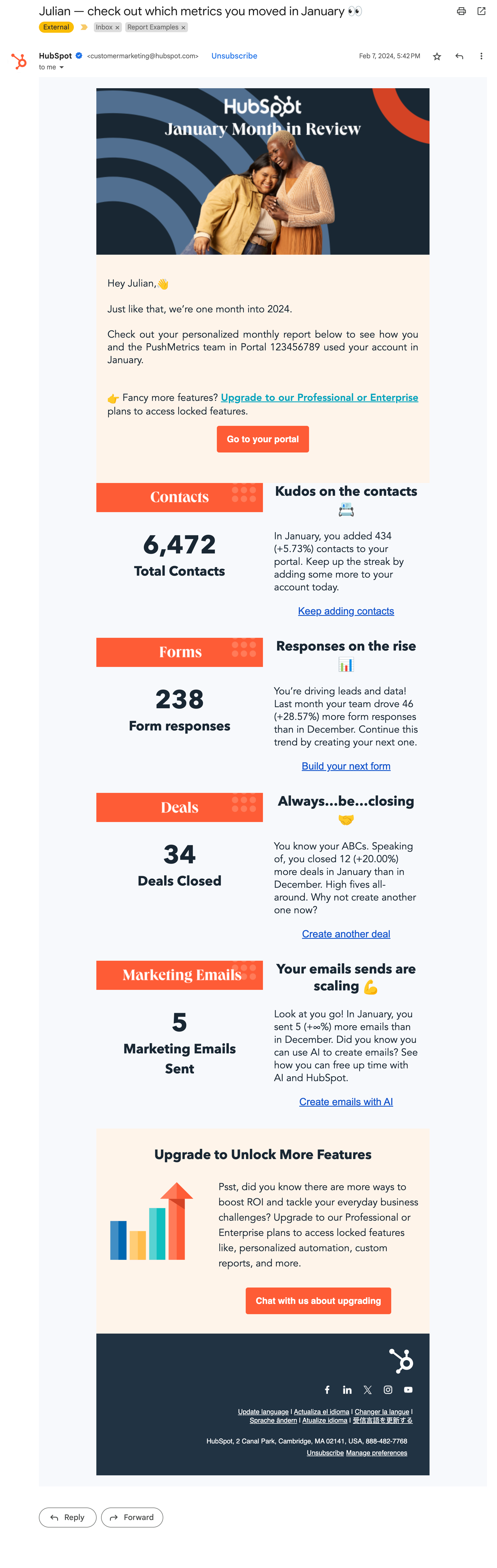
What stands out:
Visuals: The use of icons and bold colors draws attention to key metrics and actions, making the email both engaging and easy to navigate.
Personalization: The report is highly personalized, detailing the user's specific achievements and activities. By addressing the user by name and referencing their team's unique metrics, HubSpot creates a sense of individual attention and recognition.
Actionability: The email excels in providing clear, actionable insights. For each metric presented, there is a direct suggestion or link encouraging the user to take a specific action, such as creating more forms or closing more deals. This approach helps users understand how to apply the information to improve their results.
2 - Slack
Slack’s platform is known for its channels, direct messaging, and features that support both synchronous and asynchronous communication within teams and across entire organizations.
Slack sends a weekly email report aimed at admins and workspace owners, highlighting metrics like message volume, activity distribution between public and private channels, and personal activity statistics, with a clear layout and links to further details.
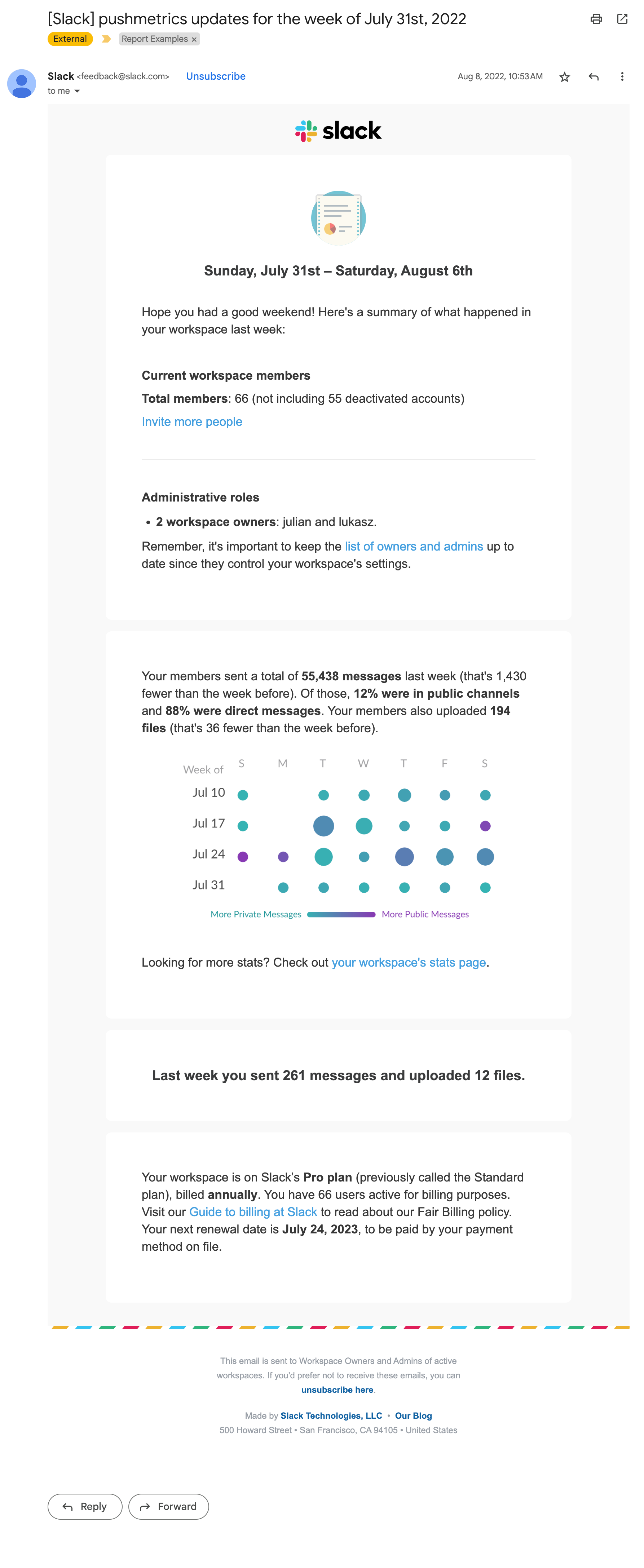
What stands out:
Visual Activity Heatmap: A unique calendar heatmap gives a visual summary of daily activities within the workspace, making it easy to identify patterns of high and low engagement.
Administrative Information: It identifies the workspace owners and provides a reminder about the importance of keeping this list updated, which is crucial for maintaining proper workspace governance. It also outlines the current subscription plan, billing cycle, and renewal date, helping the administrative users stay on top of their account management.
While the email provides good basic information, Slack could enhance its value by including additional personalization, such as comparing the user's activity to the average within the workspace or highlighting milestones, could further engage the user.
3 - Medium
Medium is an online publishing platform known for its diverse user-generated content and variety of published stories and articles.
Their usage email provides a weekly summary of the user's story performance on Medium, including metrics like views, reads, and responses.
It features a clean and straightforward design, highlighting the most successful stories and their respective view increases over the week.
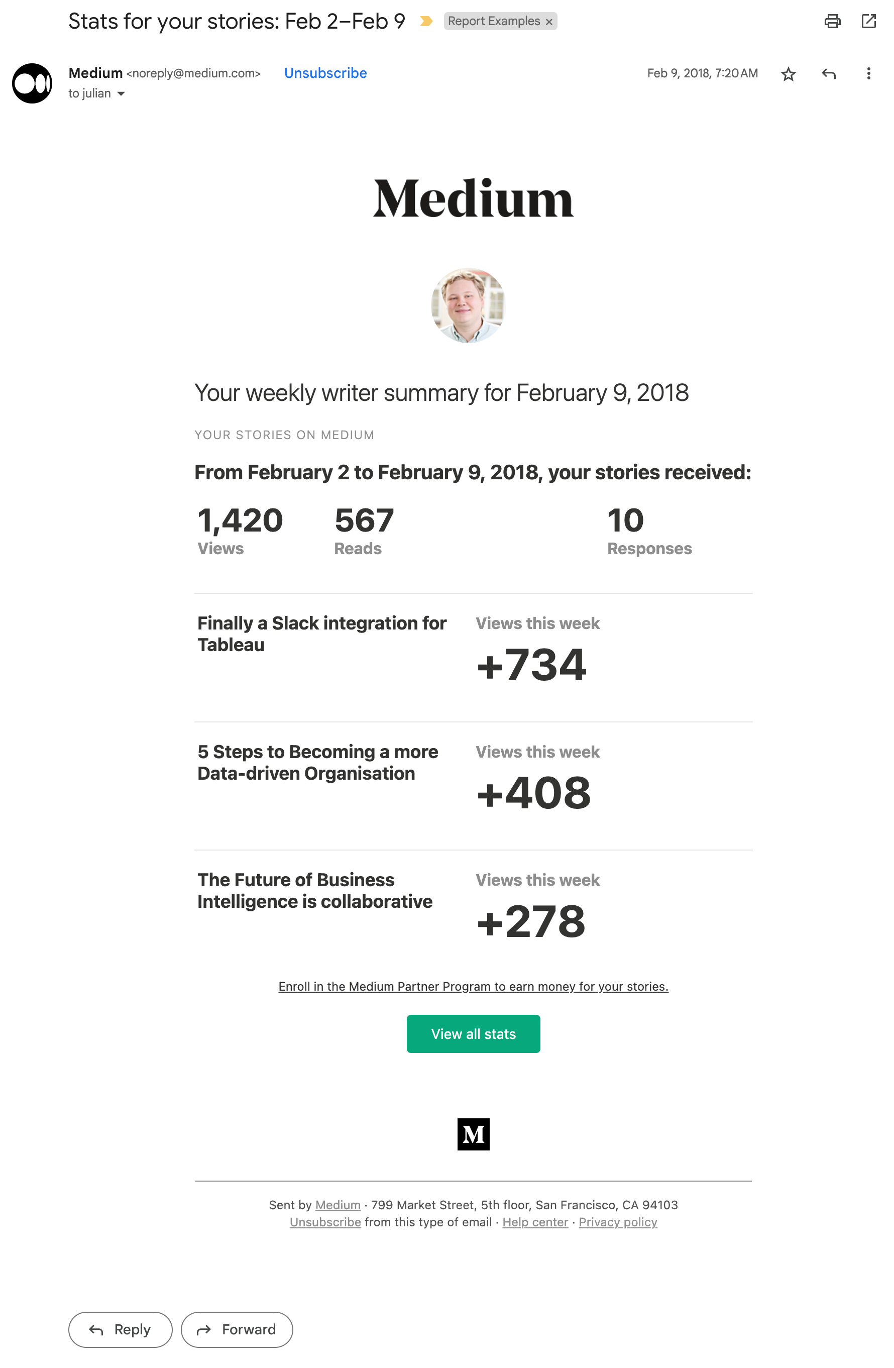
What stands out:
Less is more: The email design and the content is minimalistic with a clear hierarchy, which makes it easy to read and visually appealing. It focuses on just a few key metrics, presented as big numbers.
Actionability: The email includes actionable insights with a call-to-action button, "View all stats," encouraging the user to engage more deeply with the platform's analytics.
One area for improvement could be to inspire the user to create more stories by including more direct suggestions or tips based on the user's performance trends.
4 - Segment
Segment is a customer data platform that helps businesses collect, clean, and control their customer data.
The email provides a concise monthly overview of key performance metrics for a team's workspace on Segment, offering insights into API usage, track calls, and user identification.
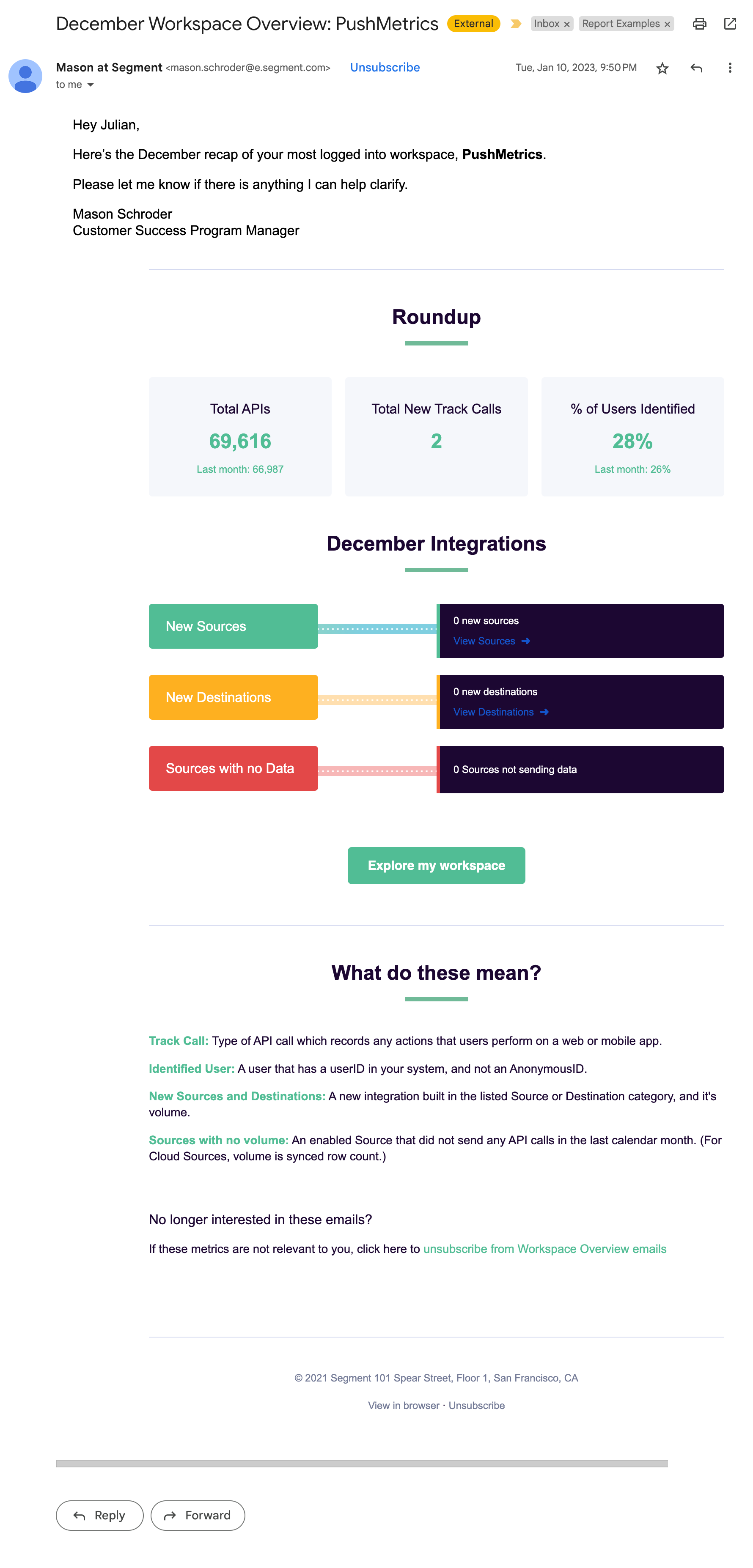
What stands out:
Personal touch: The email looks a bit like it's being forwarded by the team's customer success manager who added a personal note to the report.
Pipeline Visuals: Segment is a data pipeline tool. The stats are presented in a way that somewhat resembles a pipeline, creating a subtle reference to the product's core.
KPI Definitions: The definitions section at the end is particularly helpful and makes sure readers can understand what the numbers actually mean.
5 - Intercom
Intercom is a customer communication platform that enables companies to engage with customers through various messaging services.
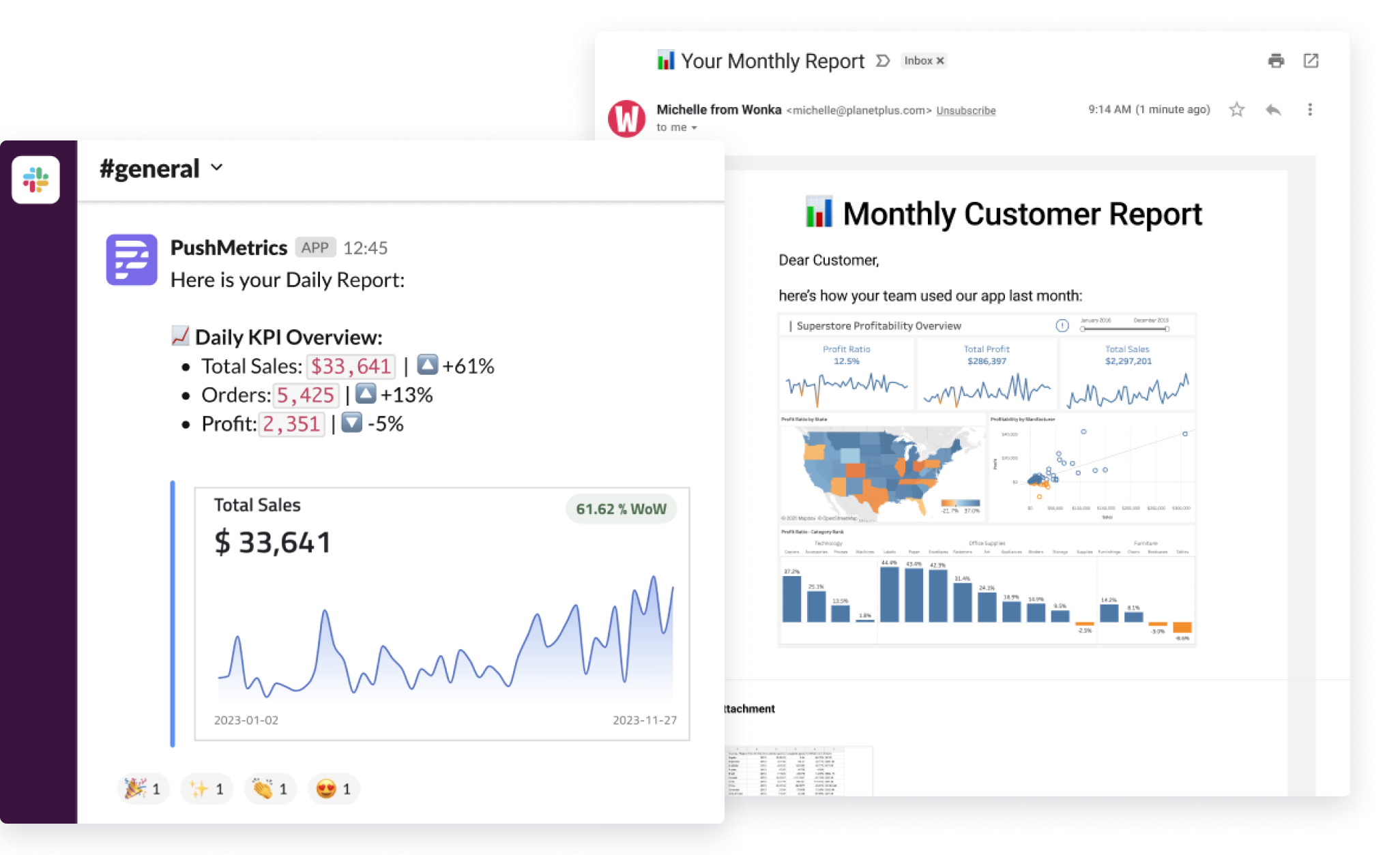
The email provides a concise daily update on user engagement, showing new user sign-ups and highlighting companies that may be losing interest ("starting to slip away").
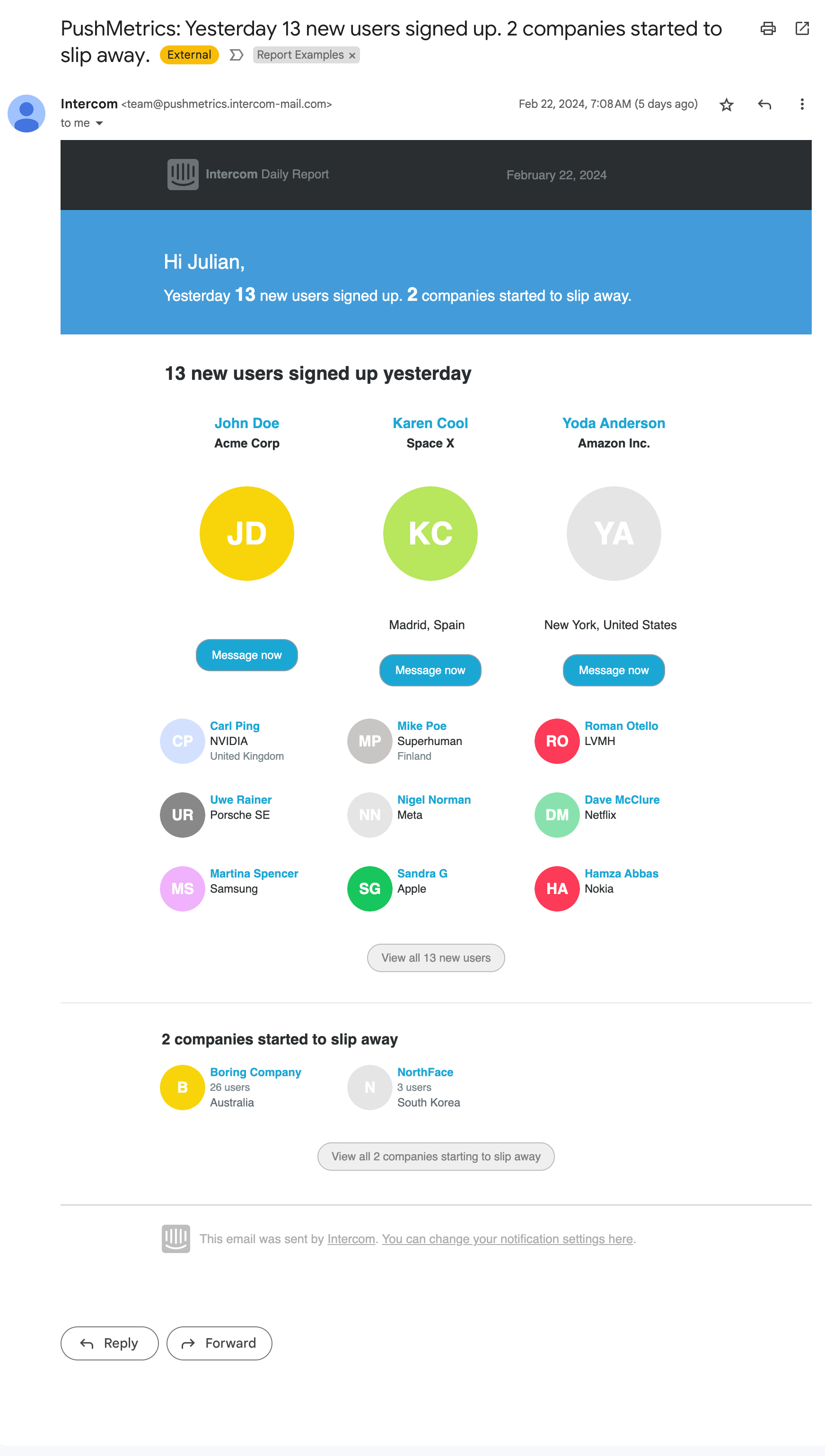
What stands out:
Subject Line: The subject line "PushMetrics: Yesterday 13 new users signed up. 2 companies started to slip away." is direct and informative, indicating both positive engagement and potential issues.
Actionability: This email is very useful for quickly identifying new opportunities for engagement and addressing potential issues with user retention. There are "Message now" buttons to immediately engage with new users, which provides clear actionable steps for the user.
Daily Frequency: The report is a daily update, which seems appropriate for a SaaS platform where daily changes in user engagement can be significant.
6 - Mailchimp
Mailchimp is an email marketing platform that offers newsletter services along with other marketing tools for businesses.
The report email is a weekly account summary from Mailchimp, detailing key performance metrics for the user's email marketing efforts through their platform.
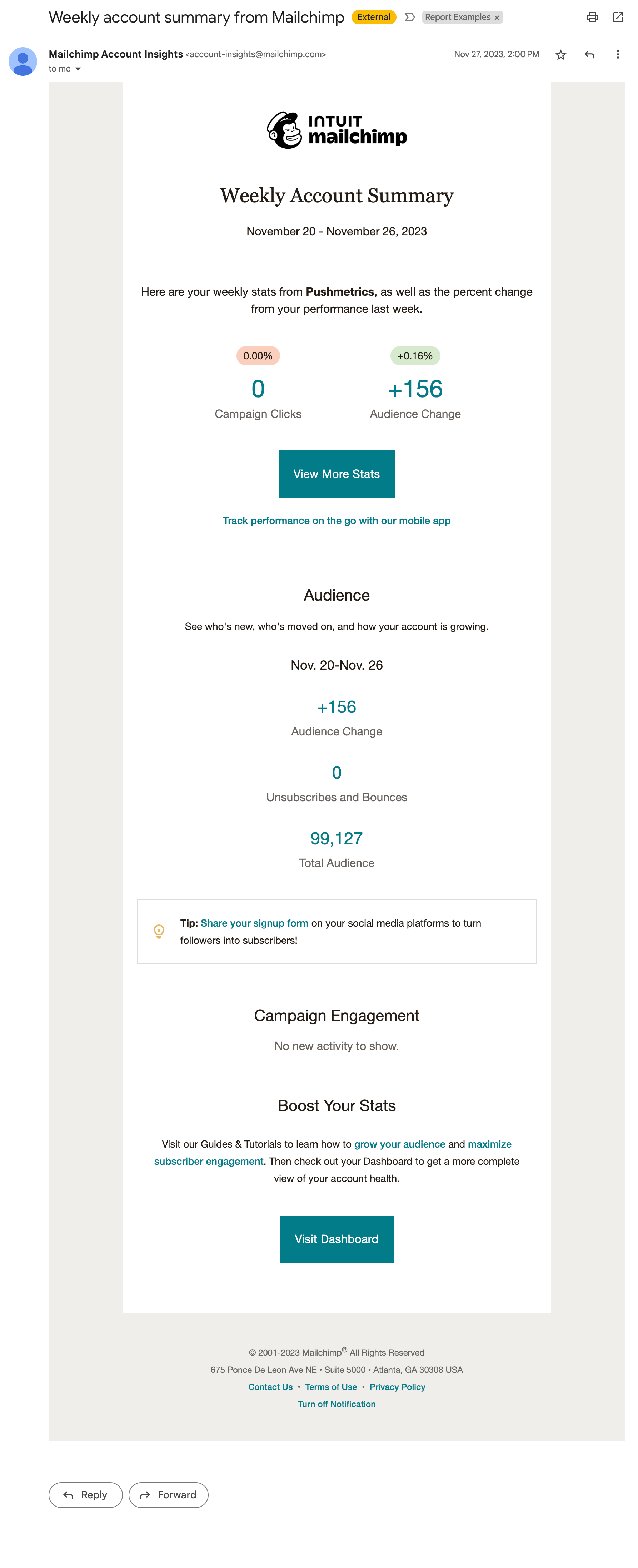
What stands out:
Tips & Call-to-Action: The email includes a "View More Stats" button and encourages visiting the dashboard for a more detailed view. It also includes tips to improve product usage and links to a learning section.
Simplicity: The email offers fundamental insights into audience growth and engagement but keeps it simple and minimalistic.
Mailchimp's weekly summary email does well in providing a snapshot of user engagement and audience growth, with a clean design that's easy to understand at a glance. However, incorporating more personalized suggestions for improving metrics or highlighting significant trends could enhance its value to users.
7 - Ahrefs
Ahrefs is a toolset for SEO and marketing running on Big Data. They cover backlink checking, competitor analysis, keyword research and more.
The email from Ahrefs provides a data-heavy monthly update on keyword rankings, detailing new keywords acquired, positions gained, and total organic keywords for which the user's site is ranking.
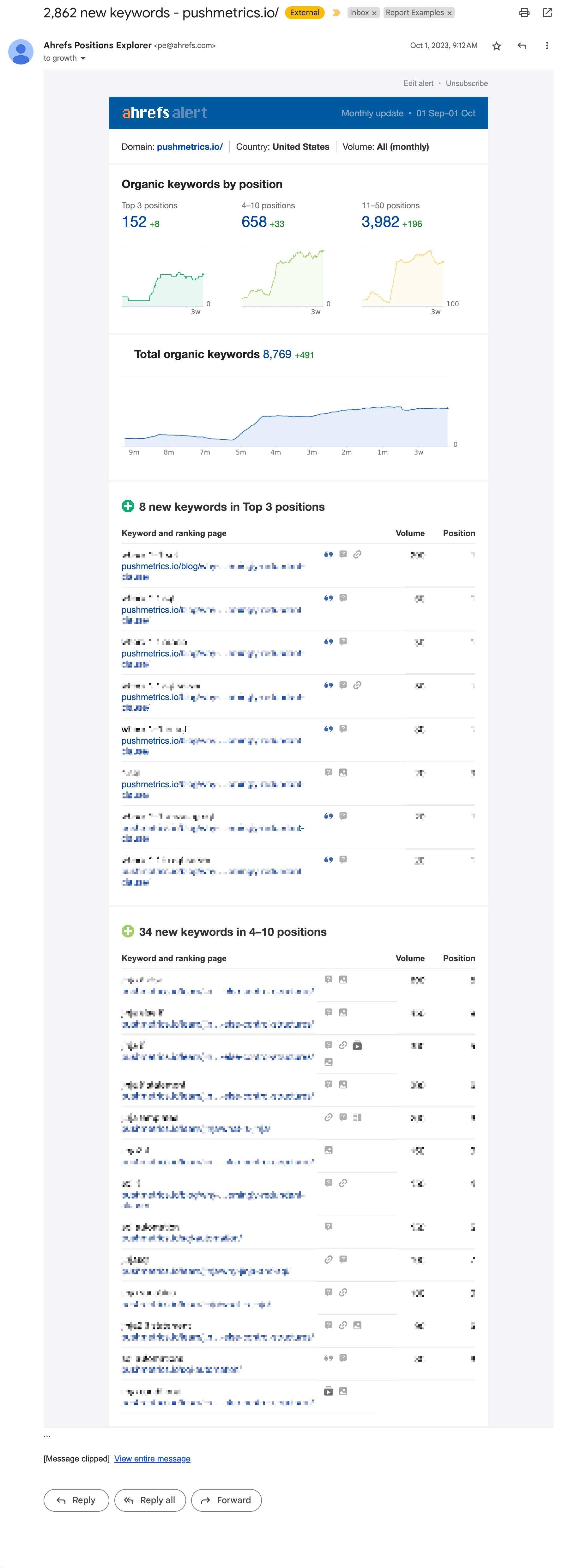
What stands out:
Line Charts: One of the few emails that include charts to highlight trends over time. This clearly stands out
Content Density: The information provided is valuable for users to track their SEO progress and understand their website's visibility in search engines. The email is long and very dense with information, which fits the data-driven nature of their customers.
Deeplinks: Every stat links back to the respecitve section of the app, inviting the user to dive deeper. In a way, this report feels like an extension of the product.
8 - Grammarly
Grammarly is a digital AI writing assistant that provides grammar checking, spell checking, and plagiarism detection services to help users improve their writing skills.
The email report from Grammarly provides a personalized weekly update on the user's writing activity, highlighting metrics such as writing streak, productivity, mastery, and vocabulary usage compared to other Grammarly users.
Standout Points:
Bar Charts: The visuals include easy-to-read charts and numerical representations of the user's performance, which make the information accessible at a glance.
Benchmarks: The charts are accompanied by text, giving context to the numbers, benchmarking the user against other users of the platform.
Includes News & Tips: The inclusion of articles with tips and new features adds educational value.
Usage Toggles: A great, visual way to highlight to the user which features of the product are being used and which they could start using.
9 - FullStory
FullStory is a web analytics company that offers tools for analyzing user interactions and experiences on websites and apps to help businesses understand and improve their online platforms.
The email report from FullStory provides a weekly summary of user interaction data for the account, detailing visitor count, average number of events, and average active time on site, along with changes in these metrics over time.
Standout Points:
Clean Design: The report features a clean, modern design with a bold color scheme that reflects FullStory's branding, and uses big numbers and change indicators for at-a-glance understanding of key metrics.
Personalization: The report includes specific segments that had significant changes week over week, such as 'Rage clicked recently' and 'Signed-up', showing tailored insights into user behavior.
10 - Google Search Console
Google Search Console is a free service offered by Google that helps website owners monitor and maintain their site's presence in Google Search results.
The email report summarizes the website's performance on Google Search for the previous month, displaying metrics like click-through rates, impressions, top growing pages, and queries that led users to the site.
Standout Points:
Data Visualization and Accessibility: The report uses clear visualizations for data, such as graphs and icons, making it easy for users to quickly understand their site's performance.
Segmented Information: It breaks down the information into categories such as content achievements, how people find the site, and audience insights, which allows for a focused analysis on different aspects of site performance.
Actionable Insights: The inclusion of top growing pages and queries, and a breakdown of devices used by the audience, provides actionable insights that can help in optimizing the site for better performance and reach.
Key Takeaways & Best Practices for Product Usage Report Emails
In a world where data drives decisions, Software as a Service companies are increasingly leveraging product usage report emails to connect with their customers. The deep dive into above email examples reveals a wealth of strategies that can elevate the way companies communicate valuable usage insights to their users.
One of the fundamental elements identified is the power of personalization. When emails reflect a user’s unique interaction with the product, it not only bolsters the relevance of the content but also significantly boosts user engagement. The more aligned the report is with the user's behavior, the more likely they are to find value in it.
Another crucial aspect is the importance of clarity and conciseness. Overloading users with information can be counterproductive. Instead, streamlined emails with clear headings and succinct bullet points allow for quick consumption and understanding. This approach respects the user’s time and fosters a smoother user experience.
Visual aids stand out as a game-changer in conveying complex data. Charts, big numbers, and graphs break down usage patterns in a visually engaging way that words alone might not achieve. They serve as quick, at-a-glance tools that users can immediately comprehend and appreciate.
The provision of actionable insights goes beyond mere data presentation. It empowers users with the knowledge to make informed decisions about their product use. Insightful reports prompt users to take action, whether to capitalize on strengths or address areas with room for improvement.
Consistency in sending these reports can create a regular touchpoint for engagement. Regular updates help users monitor their journey with the product, fostering a routine check-in that keeps the product top of mind.
Benchmarking is a subtle yet potent motivational tool. When users can compare their usage against an average or their past performance, it can ignite a desire to enhance their interaction with the product or explore features they haven't used.
Engagement cues within the email, such as actionable tips, tricks, and tutorial links, serve as invitations for users to explore the product more deeply. These cues guide users to derive more value from the product and strengthen their engagement.
SaaS companies looking to implement or enhance their product usage report emails can draw from these insights to create messages that not only inform but also engage and empower their users.
By doing so, they can transform a simple report into a cornerstone of user engagement and product value enhancement.
Build Your Own Product Usage Reports With PushMetrics
PushMetrics stands out as an end-to-end solution for creating comprehensive product usage reports. It combines the capabilities of marketing email solutions with the analytical depth of business intelligence software, streamlining the process of communicating insights.
Users can benefit from PushMetrics' ability to automate the distribution of data-driven insights and reports directly to various stakeholders without the need to juggle multiple tools. This approach not only saves time but also ensures that the reports are crafted with precision, tailored to the audience, and delivered consistently, fostering data-driven decisions across the organization.
For SaaS companies looking to implement or refine their product usage report emails, PushMetrics makes it easy to present complex data in an accessible format, ensuring that key insights lead to informed actions and sustained engagement with the product.
Julian Schulte
Related Articles
Subscribe to our newsletter
Get the latest updates from the PushMetrics team.
Thank you for subscribing.
Start sending data-driven messages today
Sign up and start using PushMetrics for free.
Or schedule a demo and discuss your use case.