An Internal Email to Tim Cook and the State of Business Intelligence
In a recently published email exchange between Apple executives, we get a glimpse into the inner workings of one of the most valuable companies on the planet.

What unfolds within just 4 emails is nothing less than a full-blown drama that no data professional ever wants to encounter — and that tells us quite a bit about the state of our industry.
The following Twitter account: Internal Tech Emails regularly publishes internal email exchanges of executives of big tech companies sourced mostly from publicly available information from lawsuits.
It’s full of amazing gems.
You can peek into the internal communication of billion-dollar deals. It shows a glimpse of how they see competition and more.
It’s quite interesting to observe how these top execs think and act — while handling something mundane like email.
In this particular case, what caught my attention is a series of 4 emails dating back to July 2016, disclosed in the 2021 lawsuit between Apple and Epic.
The email thread turns into quite a drama — at least from the perspective of a data professional.
Act 1: A ‘Mostly Harmless’ Email
It all started with a ‘harmless-looking’ email in which App Store VP, Matt Fisher summarises the development on the App Store for other top executives including Tim Cook.
The first thing that caught my attention as a data nerd is the fact that he most valuable company in the world informs its executives about KPIs.
I know what you think:
“Ahh, Apple… the pioneers of design, highest aesthetic standards, one of the most innovative places on earth… Tim Cook must be looking at the most beautiful, carefully crafted dashboards in the world. Johny Ive will be reading the latest KPIs out loud in his finest British accent in every executive meeting.”
If not this then at least Tim Cook has an app for that, right?
To all the Dashboard fanatics out there, I have some bad news for you:
Tim Cook, CEO of Apple, gets his data in an email.
Written by a human. A plain-text email sent by one of his VPs. A high-level summary, dense with information. A handful of paragraphs of plain, simple text.
Here it is:
On Jul 19, 2016, at 5:55 AM, Matt Fischer wrote:
Tim, Luca, Phil, Eddy and Joz,
For the week, the App Stores (iPhone, iPad, Watch, Apple TV and Mac App Stores) generated $580M in billings, up 9% W/W and up +47% Y/Y (4 week average). In-App Purchase generated $562M, up 10% W/W and up +50% YN (4 week average), representing 97% of the global business.
We had 272.1M customers transact on the store during the week, up +8% W/W and up +55% Y/Y. We had 26.1M paying customers in the week, up +7% W/W and up +40% Y/Y.
Pokemon Go was the top overall app for both downloads and billings for the week, with 35.8M and $47.7M respectively.
Through Sunday, it had a total of 56.3M downloads and $63.6M in billings. We are tracking its performance very closely and I will send out a dedicated update on the game later this week.
Let me know if you have any questions.
Best, Matt [Source: Twitter]
This must be a crazy shocker for us, the dashboard misfits, the data rebels, and KPI troublemakers — right?
Shouldn’t they look at a nice dashboard? Shouldn’t they self-serve?
Well, I don’t think this is bad news at all but simply a reflection of reality, confirming once again that the common notion of self-service is a myth.
I would argue that what we are witnessing here is real, actual business intelligence. In the wild. This is how things work in the real world.
I’ve done exactly this myself for some time in a small startup: As a young analyst, my most impactful role was sending a weekly email update to the executive team, often even accompanied by a spot in the weekly management meeting, summarising all the relevant movements in KPIs.
My preparation would often even include gathering intelligence from human sources — i.e. I would talk to account managers, sales, etc. to figure out reasons for drops, spikes, and trends — and then bring everything together in an information-dense executive summary.
My only critique of Matt Fisher’s report email is that it would have been more enticing and clear if it was combined with some simple visualizations. Well, and maybe it shouldn’t have been an email (more on that later).
But the first key takeaway is that in BI, the real intelligence work is done by humans connecting the dots, not dashboards and that often it’s a commentary with data presented in a text-form that is most effective.
We can see how this is true if we look at the next email — Tim Cook’s response.
Act 2: The Good.
Boy, does Tim Cook know his numbers.
On Jul 19, 2016, at 8:32 AM, Tim Cook wrote:
Report shows a record number of downloads for the week. This shows great momentum and counters the narrative that apps are dead. We should consider releasing this in some manner or minimally mentioning on the earnings call.
Tim
[Source: Twitter]
He spots the record-breaking numbers right away — even though it was not explicitly stated in the briefing.
And here is the best part: He is immediately doing the single thing we’re all rooting for: Taking action! Yesss! He takes action from the data.
He understands how this KPI maps to the broader picture and wants to use it to impress investors in the next earnings call.
But, not so fast…
Act 3: The Bad.
Now to the dramatic turning point of this story. It’s every analyst’s worst nightmare come true. The numbers….they are wrong…
And now Matt — our sad hero of this drama — has to break the news to the all excited Tim Cook:
From: Matt Fischer Date: July 19, 2016 at 9:15 AM To: Tim Cook Cc: Luca Maestri, Phil Schiller, Eddy Cue, Greg Joswiak, Kevan Parekh
Subject: Re: App Store Weekly Scorecard: Week of 7/11/2016
Tim,
As I wrote on 7/6, we have seen a dramatic increase in app downloads from farmed and/or incentivized accounts in China. As a result, we should not use these download figures publicly. Our Reporting and Analytics team is working closely with our Fraud team to identify these accounts and exclude related app downloads from our reporting, but this is very complicated and may take some time. The teams are working with Luca and Kevan on this. I’ll keep everyone posted on progress.
Best, Matt [Source: Twitter]
Matt — we all feel you. This is bad. Really bad. Can you imagine reporting wrong KPIs to freaking Tim Apple?
Of course, if Tim Cook had just remembered that email explaining the data issues from a few weeks ago, he would have known this. But of course, he didn’t. Nobody does, Matt!
So what could Matt have done better? Well, he could have mentioned this again in his first email — but that’s annoying and distracts from the important facts.
This is where we realize that maybe — just maybe — email threads are not the best place for analytics after all.
What if instead of relying on busy people remembering something mentioned 10 email threads before, this report was delivered on a more dynamic canvas?
A solution where Tim Cook would have had the chance to easily dig a bit deeper and put this plain number into context? Maybe this inflated number could have had an annotation linking to the explanation for the error or something like that.
Don’t get me wrong: I have a strong belief that the data should come to the people, not the other way around. And for some people, the best way to consume reports is in their inbox.
But then you must have an option to dig deeper instantly and collaborate around the insights not via an email thread but within the context of the data.
Act 4: The Ugly.
And now off to the grand finale.
Matt is furious and someone has to eat it.
So he’s pulling the ultimate trick out of the manager’s toolbox: He’s forwarding an email from the CEO to his analytics team with a big “WTF!!!”.
On Jul 19, 2016, at 10:00 AM, Matt Fischer wrote:
Please read Tim’s email and my response.
What’s the ETA for when we will start excluding activity from farmed and incentivized accounts in our reporting? This is becoming embarrassing.
Best, Matt
Begin forwarded message:
[Source: Twitter]

“THIS IS BECOMING EMBARRASSING.”
Ouch! Nobody wants to be on the receiving end of such an email. That data team is going to have a bad day.
The End.
Epilogue: Some Takeaways
I think this email exchange is hilarious.
Seeing top execs having to deal with mundane stuff like this is very refreshing.
If even the C-Suite of big tech companies goes through this, then maybe you don’t need to get a panic attack next time someone shouts “the numbers are wrong”.
On a more serious note, there are a few key takeaways here:
- Data Quality is a very real problem. And as Matt Fisher points out, it’s “very complicated and may take some time” to fix it. Luckily, there is testing in dbt and tools like GreatExpectations coming to our rescue.
- Good leaders know their numbers and act on them. They also trust them.
- Real business intelligence does not happen in dashboards, and email is not a good substitute either. Instead, we need a more flexible, collaborative canvas for analytics that gives us more freedom than the static nature of a dashboard and more context and connectedness than a siloed email thread.
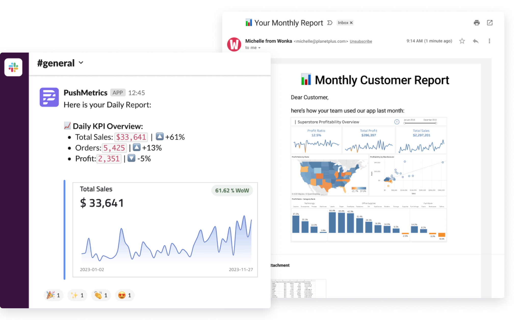
With PushMetrics, a company I co-founded, we are working on a solution for exactly this.
We believe such a canvas should feel more like a living document where data, commentary, charts, and collaboration all live next to each other.
Originally published on Hackernoon.com
Julian Schulte
Related Articles

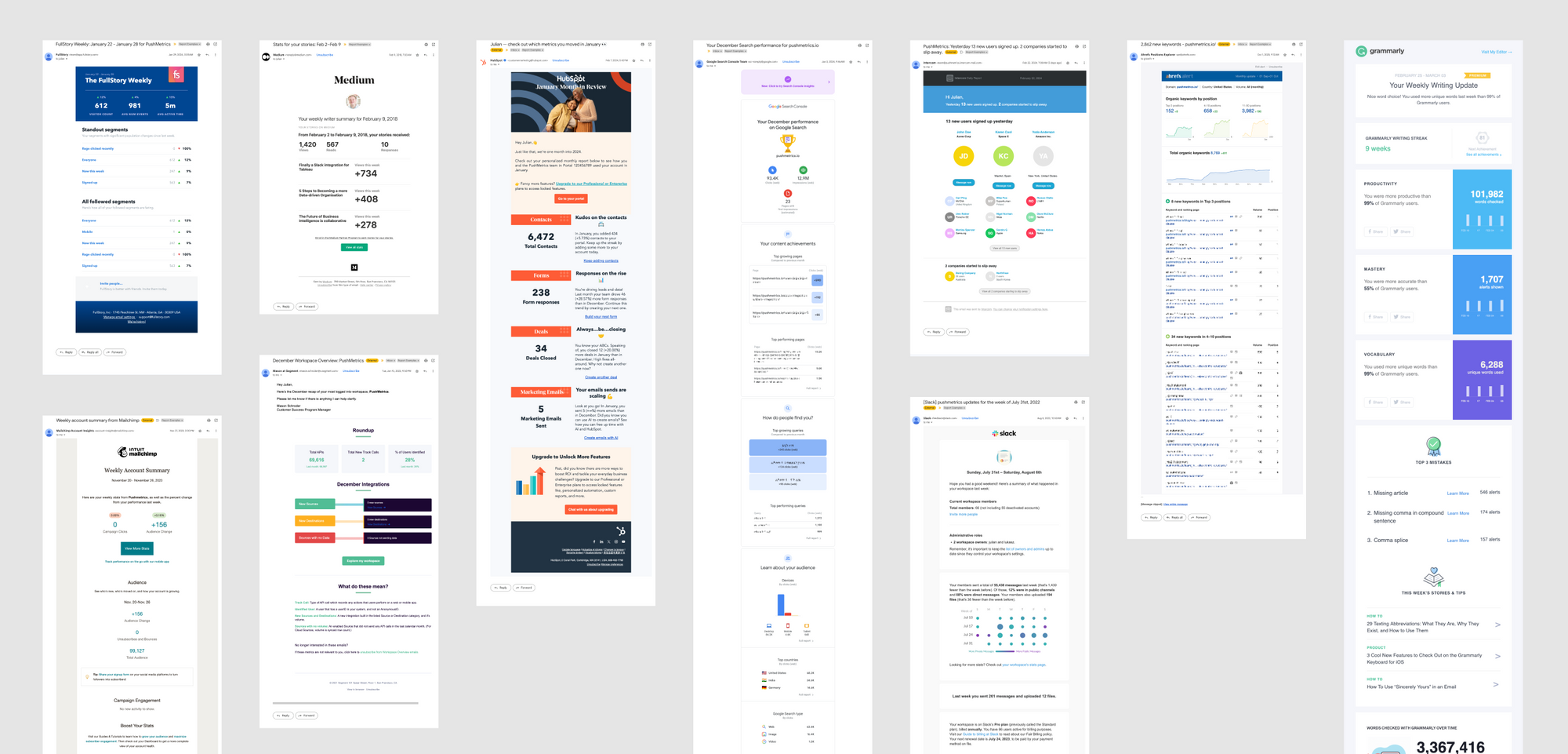
10 SaaS Usage Report Emails: How Companies Like Hubspot, Slack & Intercom Use Data To Maximize User Engagement
Product usage report emails are more than just automated messages; they're a window into how users interact with software, providing invaluable insights on engagement levels, feature adoption, and areas for improvement.

Julian Schulte

10 SaaS Usage Report Emails: How Companies Like Hubspot, Slack & Intercom Use Data To Maximize User Engagement
Product usage report emails are more than just automated messages; they're a window into how users interact with software, providing invaluable insights on engagement levels, feature adoption, and areas for improvement.
Julian Schulte
Subscribe to our newsletter
Get the latest updates from the PushMetrics team.
Thank you for subscribing.
Start sending data-driven messages today
Sign up and start using PushMetrics for free.
Or schedule a demo and discuss your use case.

